National Parks App Redesign
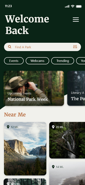
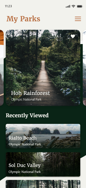
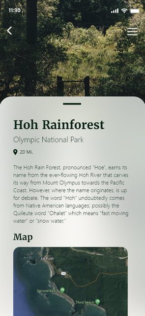
With over 400 sprawling parks located around the US, it's no surprise that the National Parks service sees around 315 million recreational visits per year. With so many visitors, there’s a high demand for information even before people step foot in the park. To meet this demand, the National Parks service released an app to help their guests navigate their park experiences, however, with so much information it can be hard to not get lost in the app. For this project, I redesigned several screens from the original app to try and create a more streamlined and intuitive layout for the app.
This project was created for a university course and is not affiliated with The National Parks Service.
App Interface


My Approach
My goal for this project was to simplify and clarify while still keeping the app recognizable as an extension of the National Parks Service. The updated design is built around the imagery of the parks and incorporates a similar color scheme to keep the app consistent with pre-established National Park branding.


